Analysis — compare laps
This is where everything happens. This tab compares two laps meter by meter and shows you where time is gained and lost, with every channel and detail panel.
Pick reference and compared
When you load the session, the app automatically builds a list of every lap with its time. You pick two:
- Reference lap — the one you use as the baseline (usually the best one)
- Compared lap — the one you want to analyze against that baseline
By default the app builds the comparison with its own criteria (not simply "best against worst"), but you can always change either one manually by tapping the corresponding selector.

Look at a single lap
If you don't want to compare against anything yet, you can look at just one lap — useful for reviewing an installation lap or getting a feel for the layout before you start comparing.
Compare with another saved session
You're not limited to comparing laps from the session you just loaded. You can bring in a lap from another date, another track day, or even another driver (if you're on a track with the same layout).
- Tap the compare-with-another-session button
- Pick the driver
- Pick the track
- Pick the saved session and the specific lap

Once you pick the specific lap, the trace updates with the real comparison — in this case, the same driver against themselves on another lap of the session:
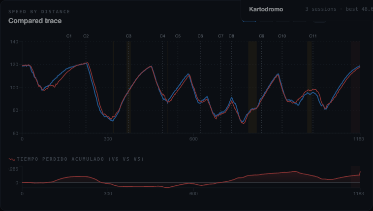
Compared trace
This is the main chart: it overlays the two laps meter by meter (not second by second) so they can be compared even with different lap times. The spots where one lap pulls away from the other are where time is lost or gained.
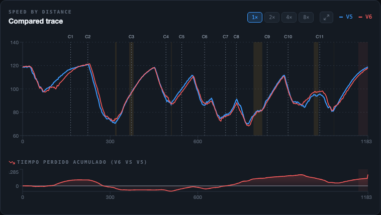
Reading the trace is the foundation of the whole analysis: every time the two lines separate, there's something worth reviewing — a longer braking zone, a slower entry, a corner exit with less traction, and so on.
Zoom 1×, 2×, 4×, 8× and drag
You can zoom into a specific stretch of the track to see the fine detail of a corner or braking zone. The available zoom levels are 1×, 2×, 4× and 8×.
- 1× — the full lap, for the overall picture
- 2× / 4× — a sector or a couple of corners, to compare the pace of one area
- 8× — maximum detail, meant for one specific corner or an exact braking point
With zoom active, you drag the chart horizontally to move along the track without losing your zoom level. This is also reflected in the channels panel below — zoom is shared between the trace and the channels.
If you're on a trackpad, you can also zoom with a two-finger pinch (or Ctrl + mouse wheel) right on the chart, for an in-between zoom level instead of jumping between the fixed buttons.
Yellow pin
A click on the trace (without dragging) drops a yellow pin at that exact meter of the track. Every panel (channels, map, corners) syncs to show both laps' data at exactly that point.
The pin shows up as a tag with the distance in meters and a button with an ✕ icon next to it to remove it — while it's placed, clicking another point on the trace just moves it there.
Cumulative time lost
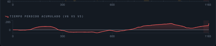
The delta chart shows, meter by meter, how much of a time gain or loss the compared lap has built up relative to the reference. A line going down means time is being lost in that stretch; one going up means time is being gained.
Channels
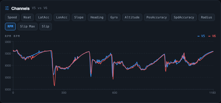
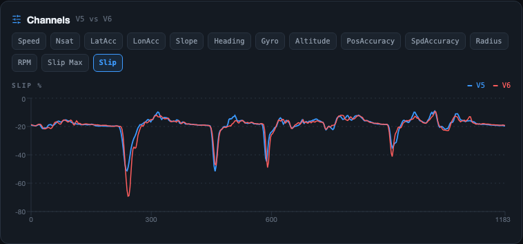
Below the trace is the channels panel, which plots any variable the logger recorded along the track: Speed, LatAcc, LonAcc, RPM, Slip, Heading, Gyro, Altitude, Radius, Nsat, PosAccuracy, SpdAccuracy and Slope, depending on what your file has.
- To switch channels, tap the button for the one you want to see and the chart changes instantly
- The channels panel's zoom is independent from the trace's — you can have the trace at 1× and the channel at 4×
Braking and throttle pickup
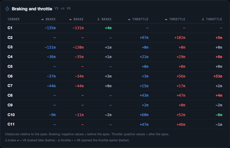
This panel (below channels) measures, for each corner, exactly where each lap started braking and where it got back on the throttle — using the corner's apex as the zero-point reference.
| Column | What it shows |
|---|---|
| Braking | Meters before the apex where braking started (always negative, or "—" if no braking was detected in that corner) — one column per lap, in its color |
| Δ brake | Difference between the two braking points — positive (green) means the compared lap braked later, i.e. more aggressively |
| Throttle | Meters after the apex where the lap got back on the throttle (usually positive; can be negative if it was already accelerating before reaching the apex) — one column per lap, in its color |
| Δ throttle | Difference between the two throttle pickup points — negative (green) means the compared lap got on the throttle earlier, i.e. better exit traction |
Fullscreen mode
The maximize icon, next to the trace's zoom buttons, opens a fullscreen mode (it hides the browser tabs and address bar) built for looking at fine detail with more room on screen — similar to RaceStudio's views.
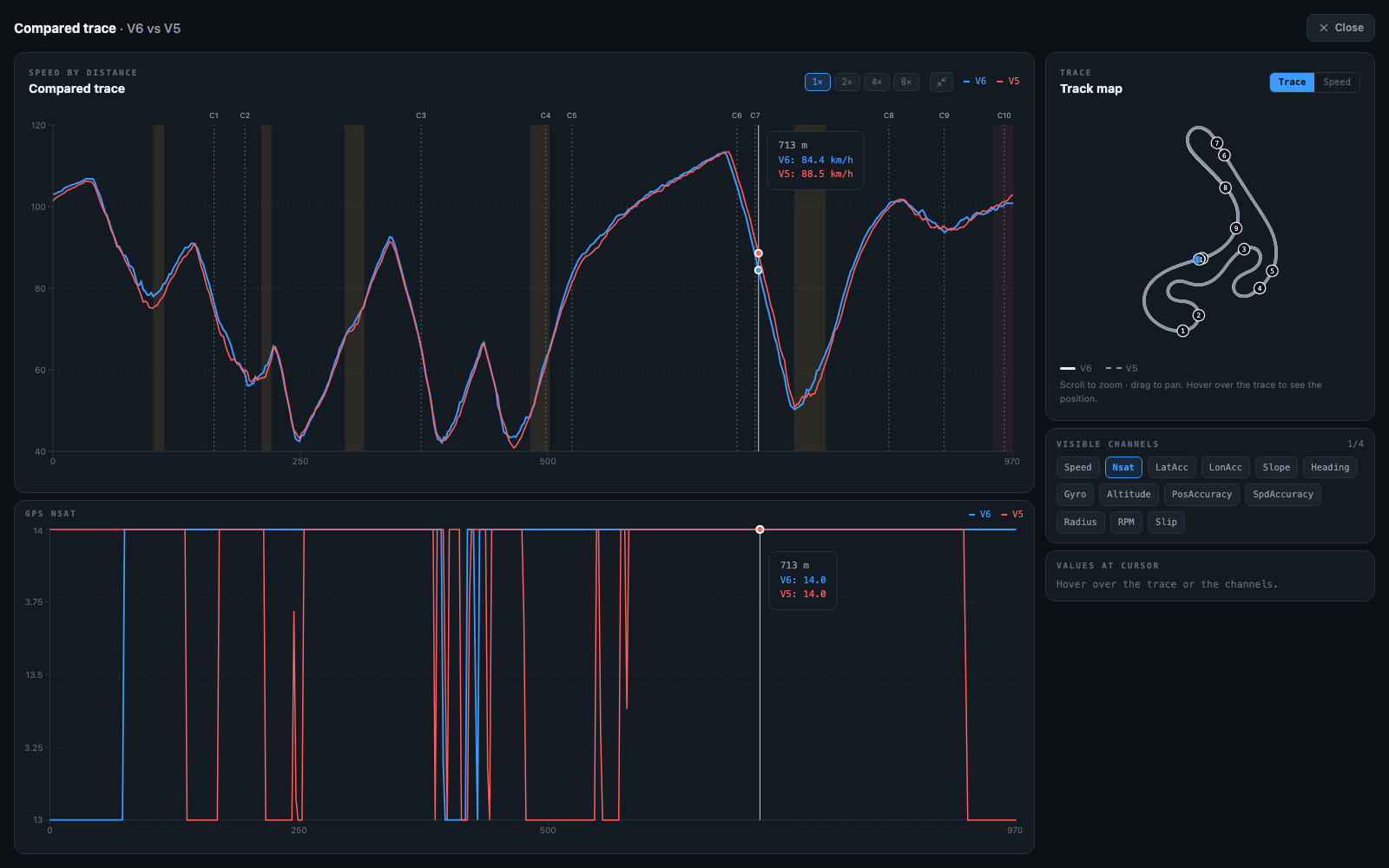
- Trace on top — the same compared trace as always, without the cumulative time-lost chart (to leave more room for the channels)
- Stacked channels below — 1 to 4 channels at a time, chosen from the "Visible channels" panel on the side (a grid with every available channel; tap one to turn it on or off). The fewer channels you have active, the bigger each one shows — they split the available space on their own
- Track map — same as in the normal view, on the side
- Values under the mouse — a panel with the distance, the nearest corner, both laps' speed, and the delta between them, updated live as you move the mouse over the trace or the channels
To exit, tap Close in the top right or press Escape.
Track map
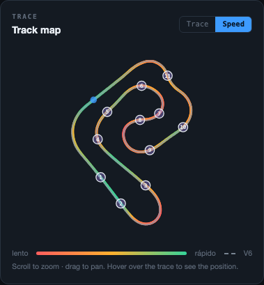
If your file has GPS, you'll see the track layout with the corners numbered. The reference lap is drawn as a solid line and the compared lap as a dotted gray line (red/green are reserved for the hit/miss markers), so wherever the lines visually separate is where one lap took a different line than the other.
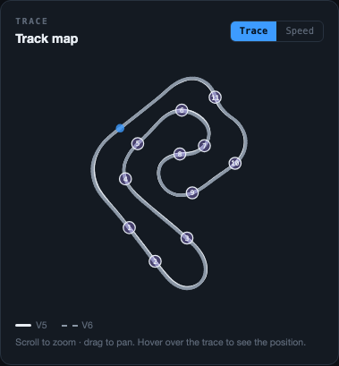
The Speed button, top right of the map, switches to a view that highlights speed at every point instead of the per-lap trajectory. You scroll to zoom and drag to pan; hovering the mouse over the trace or the channels shows the map the exact matching position.
Corners — apex speed
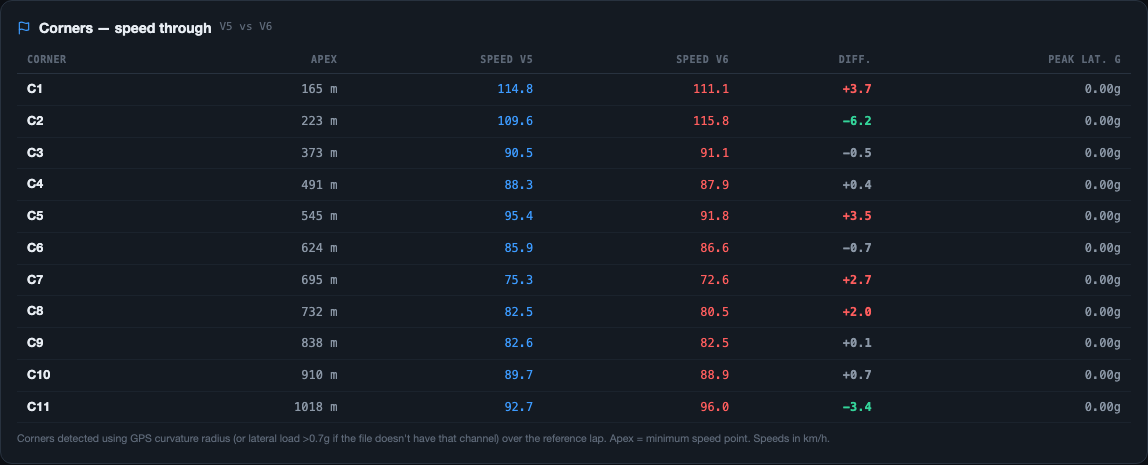
Detects corners by GPS radius of curvature if your logger has that channel (more accurate on fast or very open corners), or by lateral load over 0.7g if it doesn't — over the reference lap, the apex is the point of minimum speed within each one. This panel (further down the Analysis tab, near the traction/slip panels) shows you, corner by corner:
| Column | What it shows |
|---|---|
| Corner | Corner name (C1, C2, C3…) |
| Apex | Track meter where the point of maximum curvature is |
| Speed [lap] | That lap's apex speed — one column per lap picked, in its color (blue reference, red compared) |
| Diff. | Difference between the two — highlighted in red or green if it's over 1.5 km/h |
| Peak lat. | Peak lateral acceleration recorded in the corner (how close to the limit it was taken) |
Corner calibration
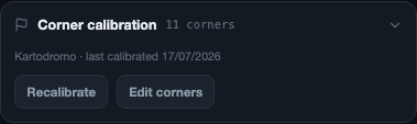
This is a separate panel (collapsible, below the map) where you manage how the corners were detected for this track — unlike the table above, this doesn't compare two specific laps, it votes across every lap in the session to define a single, persistent corner profile for that track.

- Recalibrate — votes the corner profile again using every available lap
- Edit corners — turns on manual mode over the map below
Tapping "Edit corners" opens the map in edit mode:
- Add a corner — click any empty point on the layout (where there's no marker yet) and a new corner is created right there
- Move a corner — drag its marker to the right spot
- Delete a corner — click the corner's marker to select it; a "Corner [name] selected" tag shows up with Cancel and Delete buttons
Changes stay in a draft — nothing is saved until you tap Save changes. If you want to back out of everything, Cancel discards the whole draft and goes back to the previous profile.
Friction circle
Plots lateral acceleration (the "corner →" axis) against braking/acceleration at every point of the lap, forming a cloud of points colored by speed. The 1g and 2g rings are the theoretical grip reference — the closer the cloud gets to the edge, the closer to the tire's limit the lap was driven.
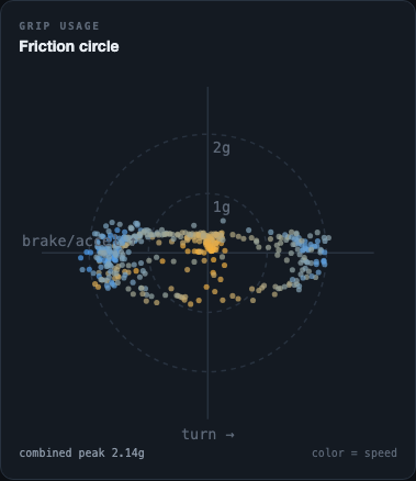
The "combined peak" figure is the maximum total acceleration recorded in the lap (lateral + longitudinal combined), the most extreme point in the whole cloud.
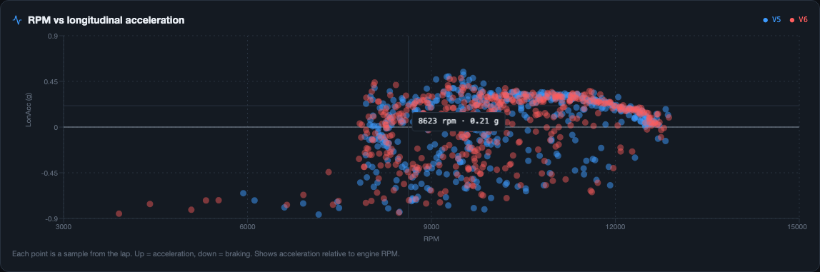
RPM vs longitudinal acceleration
This panel crosses engine RPM with longitudinal acceleration (brake/throttle) at every point of the lap. It's useful for seeing whether the driver is in the right rev range coming out of corners, and whether braking is progressive or abrupt.
Sectorization and ideal lap
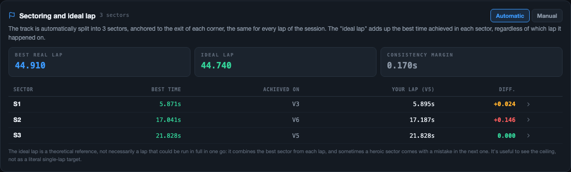
Splits the track into sectors so you can compare partial times, not just the total lap — that way you see where along the layout the difference between two laps is concentrated, without having to read the whole trace at once. There are two modes, with a selector above the panel: Automatic and Manual.
Automatic mode
The track splits itself into sectors, anchored to the exit of each corner — the same cut points apply to every lap in the session, since the corners are stable session to session. You can't edit these by hand in this mode.
Manual mode
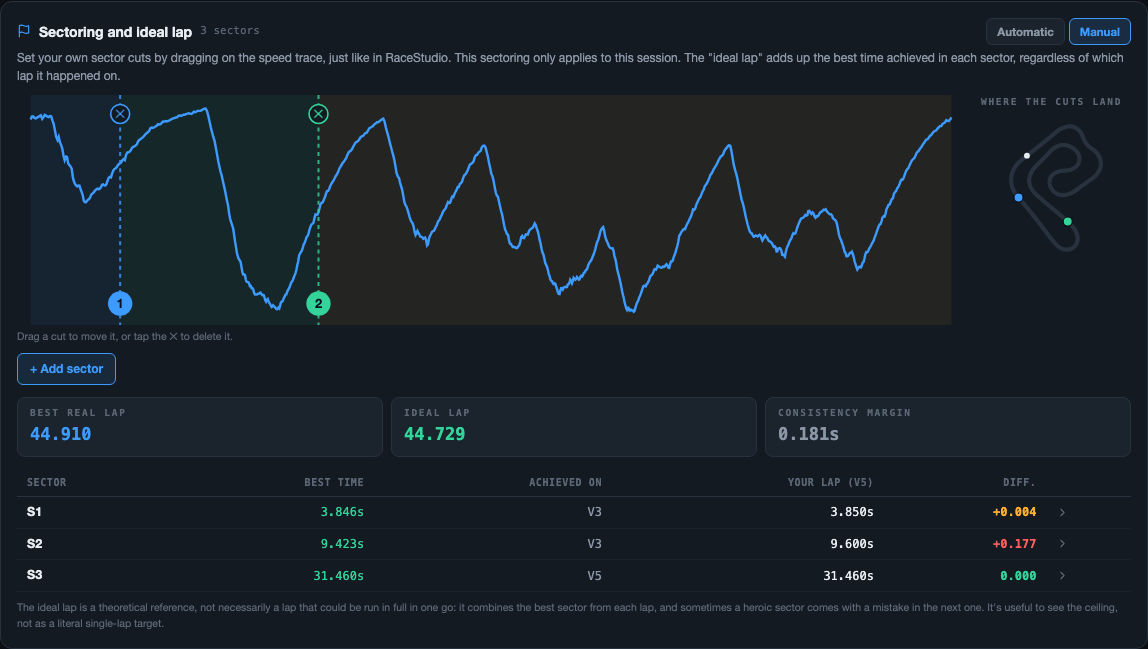
You decide where to cut each sector yourself, dragging directly on the speed trace — just like in RaceStudio. This manual sectorization only applies to this session, it isn't saved like the corner calibration is.
- Move a cut — drag the numbered marker on the trace
- Delete a cut — tap the ✕ that shows up over the marker
- Add a sector — "+ Add sector" button, adds a new cut to the trace
On the right, the "Where the cuts fall" mini map shows a colored dot for each cut, placed at the physical spot on the track it corresponds to — so you can visually confirm the cut landed where you wanted (right at the exit of a specific corner, for example) instead of having to guess just from the speed trace.
How to read the numbers
| Figure | What it is |
|---|---|
| Actual best lap | The best full lap time you actually drove in the session |
| Ideal lap | The sum of the best time achieved in each sector, regardless of which lap each one came from |
| Consistency margin | The gap between those two — how much is left on the table if you managed to string your best sectors together into one lap |
The table below breaks it down sector by sector: the best time achieved there, which lap it was achieved on ("Achieved on"), that same section's time on the lap you picked above as reference, and the difference between the two.
Braking consistency
Analyzes how repeatable a driver's braking point and intensity are across several laps of the session (not just the two you're comparing). The result is classified into ranges:
| Range | What it means |
|---|---|
| Very consistent | The driver brakes at practically the same point and with the same intensity lap after lap |
| Consistent | There's minor variation, within what's expected |
| Variable | The braking point shifts noticeably between laps |
| Erratic | There's no clear pattern — a sign it's worth working on the braking reference |
Slip channel calibration
Slip is the difference between the speed the engine would imply from its RPM and gear ratio, and the actual speed measured by GPS — 0% means there's no slippage. To calculate it correctly, the app needs the real drivetrain data for that session:
- Front sprocket — teeth on the engine sprocket
- Rear sprocket — teeth on the rear sprocket
- Wheel diameter — rear wheel, in meters, with the tire mounted
You can save a default calibration under Account → Default Slip calibration so you don't have to load it on every new session.